Applying a Theme to a Form
In the form designer, the Themes page lets you configure how your form looks by selecting or editing one of many predefined themes. You can further customize these themes to fit your organization's branding.
For more advanced customizations, see Customizing Your Form with CSS and JavaScript.
To apply a theme
- Navigate to the form designer for the form you want to apply the theme to. Select the Themes tab.
- Click the desired theme from the list of custom or default themes. Your selection will be applied to the form.
- Click Save to save your form.
- Click Preview to see what the form will look like to the person filling it out.
Customizing a Theme
You can customize one of the default themes available, then save it for later use. To customize a theme, select it in the Themes tab, then click on the Customize tab.
Configuring a Form's Style
Logo
In the Logo section, you can add a logo to the header of the form. Click on Add Logo and either pick an image file from the image gallery, upload an image file, or specify an image URL.
Background
The Background section lets you specify the appearance of the wallpaper, form body, and form border. For each, you can specify a fill color, a pattern, an image URL, and tiling settings. Tiling can be in both horizontal and vertical directions, or there can be no tiling at all. In the following diagram, we label the parts of the form that correspond to the wallpaper, the form body, and the form border.
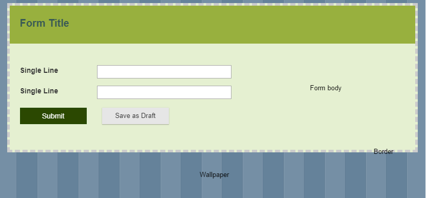
Note: The Form border section controls only settings related to the border around the entire form. Borders around smaller sections in the form are separately controlled.
Form Title
You can customize the appearance of the form title by changing its font, background, height, and border. Under Text, choose the font, color, size, and style of the title text. Under Background, you can change the settings like those described in the previous section. Under Height, specify the height (in pixels) of the form title area. Under Border, specify the color, pattern, and thickness of the border around the form title area. You can also choose which sides of the title area the border should appear on.
Form description
The form description appears under the form title. You can customize the form description text in the same ways that you can customize the form title text.
Pagination
If you have a multi-page form, you can customize the appearance of its tabs, progress bar, drop-down menu for pages, or navigation buttons.
- To customize tabs, expand the Tabs section. You can customize the appearance of the active tab (the tab that the user is on) and inactive tabs. Under each category of tabs, you can customize the text for the tab name in the font, color, size, and style of the text for the tab names. the Border and Background properties of each category of tabs can be customized in the same ways that other form borders and backgrounds are.
- To customize a progress bar, expand the Progress bar section.
- Under Shape, customize the thickness, border color, body color, and background color of the progress bar. One sample combination of body color and background color is shown below. The body color is the color of the "filled in" portion of the bar, representing the proportion of the form that has been paged through. The background color is the color for the portion of the bar representing later pages in the form. In the following sample progress bar, the body color is blue and the background color is orange.
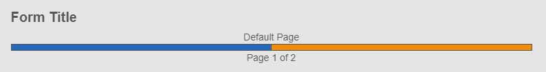
- Under Page title, specify the font, color, size, and style of the text that appears above the progress bar ("Default Page" in our image).
- Under Progress indicator, specify the font, color, size, and style of the text that appears below the progress bar ("Page 1 of 2" in our image).
- Under Shape, customize the thickness, border color, body color, and background color of the progress bar. One sample combination of body color and background color is shown below. The body color is the color of the "filled in" portion of the bar, representing the proportion of the form that has been paged through. The background color is the color for the portion of the bar representing later pages in the form. In the following sample progress bar, the body color is blue and the background color is orange.
- To customize a drop-down that is used to navigate between pages, expand the Dropdown section. Customize the appearance of the text in the drop-down menu, the border around the menu, and the background color of the menu.
- To customize the buttons used to move to the previous page and the next page of a form, expand Navigation buttons. Select the button you want to customize. You can customize the appearance of the button's text, the border around the button, and the background color of the button. If you want to change the text on the button, you will have to edit the form's pagination settings.
Section Labels
Section labels can be customized in the same ways that the form title area and text can be customized.
Fields
The following features of fields can be customized in the Fields section: Label text, body text (the text entered by a user or automatically entered), spacing between fields, and the background color or pattern of the field area when the user hovers over it.
Field Descriptions
Field descriptions are the text above or under the field that you specified when creating or editing a field. You can customize the text's font, color, size, and style.
Tooltips
For tooltips, you can customize the font, color, size and style of the tooltip text, in addition to the fill color of the tooltip area.
Buttons
This section controls the appearance of buttons used for submitting, approving, or rejecting forms. For each type of button, you can control the appearance of the button text, the button's border (color and thickness), and the color of the button.
Note: The word(s) shown on the button cannot be changed from this page. To change this textual content, go to the process diagram for the form and double-click on the message start event or user task associated with the form.
Important: The themes specified on this page will take precedence over any conflicting CSS rules on the CSS and JavaScript page.