Radio Button, Checkbox, and Drop-Down Fields
These fields allow the user to select from a predetermined list of options.
- Use a radio button field if you want the user to select only one option from a small number of options.
- Use a checkbox field if you want the user to be able to select more than one option.
- Use a drop-down field if you want the user to select only one option from a long list of options.
Note: If the total number of choices in a checkbox or radio button field exceeds 100, only the selected choices will be saved.
Field Settings
To edit a radio button, checkbox, or drop-down field
- Select the field on the canvas, and the Basic tab options will appear in the right pane.
- Under Field Label, enter the field label that will appear next to the field on the form.
-
- Under Text above field and Text below field, enter any additional text that should appear with the field. Click the Insert variables button to insert a variable into the text.
- Under File options, select Required if users must fill in this field before submitting the form. Select Read-only if users should not be allowed to modify this field.
- Under Choices, specify the options users will choose from in this field.
Note: The choices you specify for a drop-down, checkbox, or radio button must be different from each other. The same choice cannot be listed twice in the same field.
- Use the Search choices field to edit specific choices in a long list.
- Use the arrows to to the left of the Label column to rearrange the order of the choices.
- Edit the labels in the Labels column by clicking in the text field for that choice.
- Optional: Select one choice to be the default selection for the form. Checkbox fields allow more than one default to be selected.
- Click Add choice to add a new choice to the bottom of the list.
- Click Clear default value to remove the Default previously selected.
- Click Import choices with a .csv or .txt file to open a text file containing a list, and append that list to the existing choices.Note: The format of the CSV file should be:
Choice 1,Value_1,false
Choice 2,Value_2,false
Choice 3,Value_3,false
- Click Export choices as .csv file if you would like to save a copy of the choices as a .csv text file.
- Select Use a dropdown when the choice count exceeds the choice limit to automatically render the list as a drop-down on the form for long lists, set the Choice Limit to the number of choices that will be displayed before the list is converted. Does not apply to drop-drown fields.
- Select Assign values to choices to add a Value column and the ability to assign a value for use instead of the choice label. This is useful when further processing will be performed, and a shorter URL friendly value is needed. Checkbox fields have a Value column by default.
- Select Append choices to lookup results to allow a lookup rule to add to the list, rather than replacing the list, of choices.
- Select Add 'Other' choice to allow the user to enter a custom value in case the list does not contain exactly what they are looking for.
- To configure advanced options, click the Advanced tab.
- Under Layout specify the number of columns to display choices in. Does not apply to drop-down fields.
- Under Tooltip, specify the help text that will appear when users hover over the field.
- Under CSS classes, specify the CSS classes to assign this field. Learn more about using CSS.
- To configure field specific rules, click the Rules tab.
- Your field changes will be applied to the form automatically.
Note: If a required field is hidden with a field rule, it is no longer required. A required field is only required when it appears on the form.
Note: The labels, tooltip, text above, and text below settings support the use of simple HTML markup for formatting purposes.
- Select the field on the canvas and click Edit.
- Under Field label, enter the field label that will appear next to the field on the form. Click the Insert variables button to insert a variable into the label.
-
- Under Field options, select Required if users must fill in this field before submitting the form. Select Read-only if users should not be allowed to modify this field.
- Under Text above field and Text below field, enter any additional text that should appear with the field. Click the Insert variables button to insert a variable into the text.
- For checkbox and radio button fields, under Layout, specify how the field choices will be displayed (in columns or side-by-side).
- For drop-down fields, under Field width specify whether the field should be small, medium, large, or x-large in width
- Under Choices, specify the options users will choose from in this field.
Note: The choices you specify for a drop-down, checkbox, or radio button must be different from each other. The same choice cannot be listed twice in the same field.
- Select Assign values to choices if you want the value to be stored for reporting or otherwise used in the process. Assigning values to choices is especially useful if there is a monetary amount associated with a choice, and you want to use that amount to perform calculations. It's also necessary if you want to save field values as metadata in a Save to Repository service task.
- If you are populating some choices from an external database and you want to append the choices specified in step 8 to the database-populated choices, select Append choices to lookup results.
- For checkboxes and radio buttons, you can include an "Other" field in the list by selecting Add "Other" choice.
- Under Default value, select the default choice(s) for the field. For checkbox fields, you can select more than one default choice.
- To configure advanced options, click the Advanced tab.
- In the Advanced tab under Tooltip, specify the help text that will appear when users hover over the field. Click the Insert variables button to insert a variable into the text.
- Under CSS class, specify a CSS class to assign this field.
- Click Done to save your changes.
Note: If a required field is hidden with a field rule, it is no longer required. A required field is only required when it appears on the form.
Note: If multiple checkboxes are selected, the {/dataset/Checkbox} variable stores all the values in a single variable.
Additional information for checkbox fields
Checkboxes handle values differently than other field types. They require that the value start with a letter and contain no spaces. If a number is used as the first character in the value, V_ is automatically added to the beginning of that value. Additionally, if spaces are included in the value, those are replaced by the underscore character. When these values are exported or passed to a rule or workflow, these are automatically stripped from the value, and internal underscores are replaced with spaces.
For example, in the following image each Value when passed as a parameter to a workflow or stored in a lookup table via a rule would be Choice 1, Choice 2, or 5 with the underscores replaced by spaces within the words, and the number stripped of the V_ prefix.
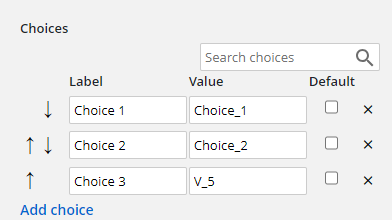
Note: Underscores not part of the prefix will always be replaced with spaces when passed out. If the value is created as o__ne with two underscores, the resulting passed value will be o ne with two spaces.