Styles in the Form Designer

The form designer provides several ways for you to customize your forms on the Theme panel. If you want to change the general appearance of your forms, the options available on the Themes tab may be sufficient. For further customizations, the Styles tab provides the ability to create a custom theme by altering the attributes of page elements. Finally, the CSS tab provides an area to write custom CSS for specific elements on the page, and provides to ability to quickly find and copy identifiers for form fields.

Note: Local system fonts and/or web-based fonts may not be available to the system that generates PDF versions of the form when printed or saved to the repository. This will cause differences in the appearance of printed or saved forms from what is displayed in the browser. This can vary from user to user.

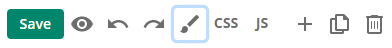
To access the Theme panel, click the paintbrush icon on the toolbar.

Using the Themes tab

If your account contains previously saved Custom Themes, these will be shown before the Default Themes. To use a theme, simply select it, and it will be applied to the form. Click Save to save your form with the new theme. You can modify any theme using the Styles tab.

Using the Styles tab

The Styles tab provides an easy to use place to customize the look of your forms and to create a custom theme for your organization. You can build a custom theme by adding a company logo and selecting company colors, fonts, and styles.

ClosedBackground

Expand this area to alter the wallpaper (the area surrounding the body of the form) and form body features.

Wallpaper options:

  • Background Color.
  • Image: Select from previously uploaded images in the Image Gallery, Upload a custom image, or specify an image by URL.
  • Tiling: Sets the direction the image will be repeated across the background starting from the top left corner. Options include Both, Horizontal, Vertical, or None.

Form Body options:

  • This area includes the same settings as wallpaper applied to the form body, with the addition of:
  • Border: Select this option to draw a border around the form body. Additional options for the border are:
    • Color.
    • Style: Select from a Solid, Dashed or Dotted line.
    • Weight: The thickness of the border in pixels.
    • Shadow: Applies a simple drop-shadow.
    • Rounded corners: Applies a simple rounded corner to the border.

ClosedForm Header

This area controls options for the header area of the form.

  • Logo: Select an image, set it to either the left or right side of the header, and adjust its width in pixels.
  • Form Title:
    • Set a different background color or image from that of the form body or wallpaper to achieve a subtle effect.
    • Change the font, text color, size, and style of the title text.
    • Add a border to the header, with options for color, style (solid, dashed, or dotted), weight, and outline location (top, bottom, left, and/or right.)
  • Form Description
    • Change the font, text color, size, and style of the description text.

ClosedPagination

This area provides options for controlling the appearance of the pagination elements when pagination is enabled. The settings will depend on the pagination style selected.

  • Active and Inactive Tabs:
    • Change the font, text color, size, and style of the tab text.
    • Add a border to the tabs, with options for color, style (solid, dashed, or dotted), weight, and outline location (top, bottom, left, and/or right.)
  • Progress Bar Shape:
    • Set the bar thickness, border color, active page bar color, and background color (for inactive page).
  • Progress Bar Title
    • Change the font, text color, size, and style of the progress bar title text.
  • Progress Indicator
    • Change the font, text color, size, and style of the indicator text.
  • Drop-Down
    • Change the font, text color, size, and style of the drop-down text.
  • Previous and Next Buttons
    • Change the font, text color, size, and style of the button text.
    • Add or change the border of the buttons, with options for color, style (solid, dashed, or dotted), weight, and outline location (top, bottom, left, and/or right.)

ClosedContainer Labels

This area provides options for controlling the appearance of collection, table, and section field headers.

  • Text:
    • Change the font, text color, size, and style of the container title text.
  • Background:
    • Set a background color or image as wallpaper to achieve a subtle effect.
    • Add a border, with options for color, style (solid, dashed, or dotted), weight, and outline location (top, bottom, left, and/or right.)

ClosedFields

This area provides options for controlling the appearance of all basic and advanced fields.

  • Label and Body Text
    • Change the font, text color, size, and style of the field label or body text.
  • Selected State
    • Set a background color to highlight the field when it is selected.
  • Text Above and Below Field
    • Set a background color to highlight the field when it is selected.
  • Tooltip
    • Set a background color to highlight the field when it is selected.
    • Change the background color of the tooltip to help it stand out from the rest of the form.

ClosedButtons

This area provides options to alter the appearance of the action buttons on a form. These are separate from the pagination buttons.

  • Change the font, text color, size, and style of the action button(s) text.
  • Customize the background color.
  • Set a border to frame the button, and adjust the border color and border weight .

Using the CSS tab

For adding or removing CSS classes in the advanced field settings, or with field rules or JavaScript that add or remove CSS classes, custom CSS classes can be created using the CSS Editor on this tab.

Note: Custom CSS may interfere with built-in CSS features when the form is presented to users on some screens or devices. Please use caution when adding custom CSS. Using this feature may cause your form to behave unexpectedly.

The CSS editor window allows you to write custom CSS code in a simple text editor style format.

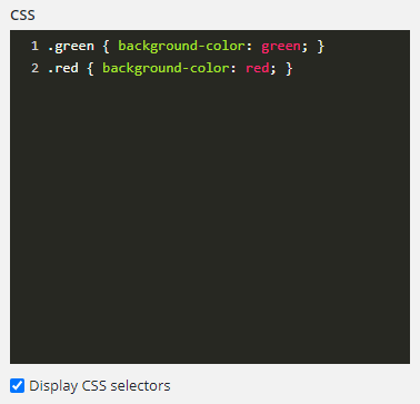
To find identifiers for specific form fields, select the Display CSS selectors checkbox, and field identifiers like the Field ID, Variable Name, and Variable ID will be displayed on the canvas near the field labels. The values of these identifiers can be quickly copied by clicking on the identifier name.

Note: If your form incorporates pagination, to view identity information for fields on other pages you will need to change the current page in the designer and then return to the CSS editor. Anytime you select an item on the canvas, the right pane will return to the Settings view.

To quickly access the CSS tab, select the CSS button on the toolbar.

For more information about creating custom CSS, see Getting Started with CSS.