Activity Proxy Property Edit Control Tab
The Edit Control tab in the Activity Proxy Properties step allows you to determine what the property box will look like and how the user will interact with it in the Workflow Designer. The options in this tab change depending on the property type of the property selected in the left-hand column.
String Properties
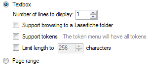
If your property is a string, you can configure the property box to contain a text box or a page range box. ![]() Show me what the Edit Control tab looks like for a string property.
Show me what the Edit Control tab looks like for a string property.
- Textbox: Select this option to have the property box contain a text box. You can further configure the text box with the options listed below.
- Number of lines to display: Type a number or use the scroll box (up-and-down arrows)
 to specify the height of the text box in rows. Typing 3 in this box, for example, will create a text box that can fit three lines of text.
 - Support browsing to a Laserfiche folder: Select this option to create a Browse button
 next to your text box. This button will allow the user to browse through their Laserfiche repository and select a folder. Once a folder is selected, its path will appear in the text box.
 - Support tokens: Select this option to create a Token button
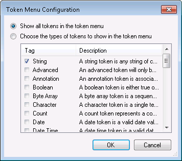
 next to your text box. Click The token menu will have all tokens to choose which specific token types will appear on the token menu. In the
  Token Menu Configuration dialog box, select Choose the types of tokens to show in the token menu and select token tags from the list.
 - Limit length to: Select this option to specify how many characters the text box can hold. Type a number or use the scroll box (up-and-down arrows)
 to specify a number.
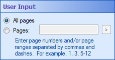
 - Page range: Select this option to create an edit control that allows users to specify all pages or a specific page range for the document the activity is acting on. This control allows users to specify pages by using numbers, commas, spaces, and dashes (and, thus, this property has a string value).
 Show me what this edit control looks like.
Note: If you assign more than one of the following type tags to your token, this order will be used to determine how the token will be evaluated: string, character, date time, time, date, integer, long integer, short integer, number, and Boolean. Only the tag that appears closest to the start of this list will be respected when evaluating conditions.
Example: The property you are configuring should have an integer value, so you only want tokens with numerical values to appear in the token menu. You select Integer, Number, Long Integer and Short Integer in the Token Menu Configuration dialog box.
Note: Besides the type tags listed in the Token Tags section, there are also descriptor tags, such as ID and User. These descriptors also help place your new token on the appropriate token menus, but they will not affect how your token is evaluated in conditions.
Integer Properties
If your property is an integral numeric type (Integer, Short, Long, Byte, Unsigned Integer, Unsigned Long, Unsigned Short, or Signed Byte), you can configure the property box to have a spin control or text box. You can also set maximum and minimum amounts for the number. ![]() Show me what the Edit Control tab looks like for an integral numeric property.
Show me what the Edit Control tab looks like for an integral numeric property.
- Spin control: Creates a text box with scroll box (up-and-down arrows)
 . A spin control will only accept digits, commas, a single period, and a single minus sign. Next to Increment specify how much will be added to or removed from the amount specified in the spin control when a user clicks the up or down arrows.
 - Textbox: Creates a text box similar to the one used for a string property, but with fewer options. An integer text box provides only a single row for text.
- Support tokens: Creates a Token button
 next to your text box. By default, only the appropriate numerical token types will appear when a user clicks this button. However, you can change which token types appear by clicking on the link next to the Support tokens option. When you click the link, the
  Token Menu Configuration dialog box will appear. Select Choose the types of token to show in the token menu, and select token tags from the list.
 - Minimum: Sets the minimum value allowed in the property box. If a user types a value lower than this one, the value will automatically be reset to this value.
- Maximum: Sets the maximum value allowed in the property box. If a user types a value higher than this one, the value will automatically be reset to this value.
Example: If you type 10 next to Increment here, when a user clicks the up or down arrows in the activity's property box, the amount will increase or decrease by 10.
Note: If you assign more than one of the following type tags to your token, this order will be used to determine how the token will be evaluated: string, character, date time, time, date, integer, long integer, short integer, number, and Boolean. Only the tag that appears closest to the start of this list will be respected when evaluating conditions.
Note: Besides the type tags listed in the Token Tags section, there are also descriptor tags, such as ID and User. These descriptors also help place your new token on the appropriate token menus, but they will not affect how your token is evaluated in conditions.
Enumeration Properties
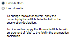
If your property is an enumeration, you can choose to have the property box display radio buttons or a drop-down list. ![]() Show me what the Edit Control tab looks like for an enumeration property.
Show me what the Edit Control tab looks like for an enumeration property.
- Radio buttons: All the values of the enumeration are displayed as radio buttons. The buttons used to select between Radio buttons and Drop down list in this tab are examples of radio buttons. Only one radio button can be selected at any time.
- Drop down list: All the values of the enumeration are in a list that appears when the user clicks the drop-down menu. Only one item can be selected from the list.
Flagged Enumeration Properties
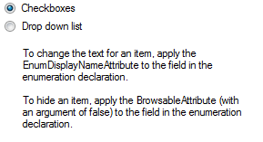
When defining an enumeration, you can add the FlagsAttribue to the enumeration to turn it into a flagged enumeration. Flagged enumerations allow you to select more than one enumeration value at once. If your property is a flagged enumeration, you can choose to have the property box display checkboxes or a drop-down list. ![]() Show me what the Edit Control tab looks like for a flagged enumeration property.
Show me what the Edit Control tab looks like for a flagged enumeration property.
- Checkboxes: Each value in the enumeration is listed as a checkbox. The user can select checkboxes to include values or clear checkboxes to exclude values.
- Drop down list: All the values of the enumeration are in a list that appears when the user clicks the drop-down menu. When a user selects an item from the list, the item will appear in the property box and another drop-down list will appear so that they can choose another item. The user can exclude an item by not selecting it from the drop-down menu or, if the user already selected the item, by clicking the red X
 next to the item.
  Show me what this looks like.
Boolean Properties
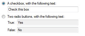
If your property is a Boolean, you can choose to have the property box display a checkbox or two radio buttons. ![]() Show me what the Edit Control tab looks like for a Boolean property.
Show me what the Edit Control tab looks like for a Boolean property.
- A checkbox, with the following text: Select this option to have a checkbox appear in the property box. You can specify what text will appear next to the checkbox by typing in the text box below this option. If the user selects the checkbox, the property will be true. If the user clears the checkbox, the property will be false.
- Two radio buttons, with the following text: Select this option to have two radio buttons appear in the property box. You can specify what text will appear next to each radio button by typing in the text boxes next to True and False. If the user selects the first radio button, the property will be true. If the user selects the second radio button, the property will be false.
Decimal Properties
If your property is a decimal numeric type (Float/Singe, Double, or Decimal), the property box will have a text box that can support tokens and that can have a minimum and/or maximum value. ![]() Show me what the Edit Control tab looks like for a decimal property.
Show me what the Edit Control tab looks like for a decimal property.
- Support tokens: Creates a Token button
 next to your text box. By default, only decimal and integer tokens will appear on the token menu. However, you can change which token types will appear by clicking on the link next to the Support tokens option. When you click the link, the
  Token Menu Configuration dialog box will appear. Select Choose the types of token to show in the token menu, and select token tags from the list.
 - Minimum: Sets the minimum value allowed in the property box. If a user types in a value lower than this one, the value will automatically be reset to this value.
- Maximum: Sets the maximum value allowed in the property box. If a user types in a value higher than this one, the value will automatically be reset to this value.
Note: If you assign more than one of the following type tags to your token, this order will be used to determine how the token will be evaluated: string, character, date time, time, date, integer, long integer, short integer, number, and Boolean. Only the tag that appears closest to the start of this list will be respected when evaluating conditions.
Note: Besides the type tags listed in the Token Tags section, there are also descriptor tags, such as ID and User. These descriptors also help place your new token on the appropriate token menus, but they will not affect how your token is evaluated in conditions.
Property Binding Control
If you selected the Make this property reference another activity’s property instead of requiring its own value option in the Advanced tab, the property will have ![]() an edit control that allows you to link to another activity's property regardless of the property’s type.
an edit control that allows you to link to another activity's property regardless of the property’s type.
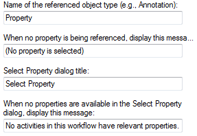
The user can select any custom activity's property that is of the same type and that has the Allow other activities to reference this property option selected in the Advanced tab. You can configure the ![]() following options for this control.
following options for this control.
- Name of the referenced object type: Enter a name for the type of property this property will reference.
- When no property is being referenced, display this message: Enter the message that will appear when the user has not selected a property.
 Show me where this message will appear.
 - Selected property dialog title: When the user clicks the Select link, a dialog box opens that allows them to select the property reference. Enter a name for that dialog box.
 Show me where this title will appear.
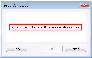
 - When no properties are available in the Select Property dialog, display this message: Enter a message that will appear in the Select Property dialog box if no properties are available to be referenced.
 Show me where this message will appear.
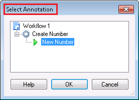
Example: If this property box references the annotations created by other activities, you might type "Annotation" here. ![]() Show me where the word "Annotation" will appear.
Show me where the word "Annotation" will appear.
Custom Edit Control
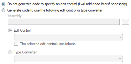
If your property is not one of the above types, and if you did not select the option Make this property reference another activity’s property instead of requiring its own value from the Advanced tab, you can select a custom edit control. ![]() Show me what the Edit Control tab looks like for a custom edit control.
Show me what the Edit Control tab looks like for a custom edit control.
- Do not generate code to specify an edit control: Select this option to not generate any code for your edit control. If you select this option, the property may not show up in the Properties Pane because the Workflow Designer may not be able to automatically create an edit control for it. You can manually modify the activity proxy code to specify the edit control once the code is generated. We recommend this option only if you have not yet created a custom edit control but still want to generate the activity proxy code.
- Generate code to use the following edit control or type converter: Select an assembly that contains the custom control or type converter that you want to use by clicking the Browse button
 and browsing to the assembly. Choose if you want to use an edit control or a type converter, as described below:
 - Edit Control: Allows you to specify a custom edit control from the drop-down list. Select The selected edit control uses tokens if any controls inside your edit control use tokens.
- Type Converter: Allows you to use a .NET Type Converter class so that you can use a text box or a drop-down control for your complex type. If you overload the TypeConverter.GetStandardValuesSupported method in your Type Converter to return true, the control will look like a drop-down list with the values specified by the TypeConverter.GetStandardValues method. Otherwise, the edit control will look like a text box.
Note: This option may have a different name if your property has a type converter or an edit control associated with it. If your property has a type converter, then selecting this option will use the type converter by default. If your property has an edit control, then it will use the edit control by default.
Note: For your edit control to appear in the list, it must inherit from the base class Laserfiche.UI.EditPanel.EditPanelControlBase.
