Add Text Box
This activity adds a text box to a page of a Laserfiche document. See the tokens this activity produces.
![]() How does this activity look in the Designer Pane?
How does this activity look in the Designer Pane?
- Drag it from the Toolbox Pane and drop it in the Designer Pane.
To configure this activity
Select the activity in the Designer Pane to configure the following property boxes in the Properties Pane.
See the following options:
-
 Activity Name
Once added to a workflow definition, the default name of an activity can be changed. Providing a custom name for an activity helps you remember the role it plays.
To name an activity
- Add an activity to your workflow by dragging it from the Toolbox Pane and dropping it in the Designer Pane.
- Select the activity in the Designer Pane.
- Under Activity Name in the Properties Pane, replace the default name.

Note: Activity names cannot be the same as any other activity name in the workflow, they cannot be the same as the workflow's name, they must be less than 100 characters, they must contain at least one alphanumeric character, they cannot be "Name," and they cannot be the same as the activity's runtime type (which is usually only an issue with custom activities).
-
 Activity Description
Use the Activity Description to provide descriptive text to help you remember the role that the activity plays in the workflow. All activities contain a default description that you can modify while constructing your workflow.
To modify an activity description
- Add an activity to your workflow by dragging it from the Toolbox Pane and dropping it in the Designer Pane.
- Select the activity in the Designer Pane.
- Under
 Activity Description in the Properties Pane, replace the default description.
-
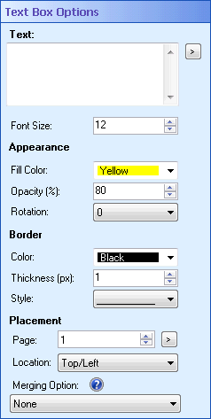
 Text Box Options
The
 Text Box Options property box contains settings for the Add Text Box activity.
To configure Text Box Options
- Add the Add Text Box activity to your workflow definition by dragging it from the Toolbox Pane and dropping it in the Designer Pane.
- Select the activity in the Designer Pane.
- Under Text Box Options in the Properties Pane, configure your text box.
- Under Text, type the text that will appear on the text box. Click the Token button (right arrow)
 to use tokens.
 - Next to Font Size, select how large you want the text in the text box to be.
- In the Appearance section, configure the following options:
- Fill Color: Select the background color for the text box from the drop-down menu or select a custom color by clicking More.
- If you select More, click Define Custom Colors and use the color selection tool or input a color using an RGB color code. Once a color is selected, click Add to Custom Colors. Select the custom color in the Custom Color group box and click OK.
- Opacity (%): Select how opaque the text box will be. If you select 100% opacity, the text box's background will be completely opaque: you will not be able to see the document behind the text box. If you select 1% opacity, the text box's background will be transparent. Type an opacity percentage between 1 and 100 or use the scroll box (up-and-down arrows)
 to select a percentage.
 - Rotation (degrees): Select how many degrees (if any) the text box will be rotated when it is added to the page. Use the drop-down menu to choose 0 degrees, 90 degrees, 180 degrees, or 270 degrees.
- In the Border section, configure the following options:
- Color: Select the border color for the text box from the drop-down menu or select a custom color by clicking More.
- If you select More, click Define Custom Colors and use the color selection tool or input a color using an RGB color code. Once a color is selected, click Add to Custom Colors. Select the custom color in the Custom Color group box and click OK.
- Thickness (px): Specify how thick, in pixels, the text box's border will be by typing a number or by using the scroll box (up-and-down arrows)
 . If you specify 0 pixels, the text box will not have a border.
 - Style: Select a border style from the drop-down menu. The border can be a solid line, a line with spaces in it, a dotted line, or a combination of lines and dots.
- In the Placement section, configure the following options:
- Page: Configure which page the text box will be added to by typing a number, using the scroll box (up-and-down arrows)
 , or clicking the Token button (right arrow)
  to use tokens.
 - Location: Select the location on the page where the text box will appear.
- To specify a custom location: In the Location drop-down menu, select
 Custom. Specify the X and Y coordinates for the text box in pixels from the Top/Left of the page by typing a number or by using the scroll box (up-and-down arrows)
  . Click the Token button (right arrow)
  to use tokens.
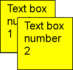
 - Merging Options: If you have more than one text box in the same location, you can choose how the text boxes will be displayed. Under
 Merging Option, use the drop-down menu to select a display style.
 - None: Places the new text box on top of the existing text box.
- Replace: Replaces the existing text box with the new text box.
- Append Text: Adds the text of the new text box to the existing text box.
- Cascade: Places the new text box slightly offset from the existing text box.
 Show me what this looks like.
Note: Text boxes are considered to have the same location if they have the same upper-left coordinate, if their centers are close to each other, or if one text box's borders are completely inside another text box.
Note: Text boxes will only be merged if they have the same protection level.
Note: The size and shape of the text boxes and the distance between the cascading text boxes will depend on the resolution of the imaged page. The lower the resolution, the larger the text boxes will appear.
 Show me what this looks like.
 -
 Text Box Protection
Use the
 Protection property box to configure the protection level the stamp.:
- Public: Public annotations can be viewed and modified by anyone who has access to the document the annotation is placed on in Laserfiche.
- Protected: Protected annotations can be viewed by anyone but can only be modified by the user that created the annotation (in this case the Workflow User) or by the document owner.
- Private: Private annotations can only be viewed and modified by their creator. When the Add Sticky Note, Add Text Box, or Apply Stamp activity adds an annotation, the creator is the Workflow User. The private setting ensures that only Workflow User (or someone logged in as the Workflow User) can see and interact with the annotation.
Example: You want to create an annotation that is hidden from all users in Laserfiche, such as a text box that contains an employee's salary. However, you want that text box to appear when you email the employee. By configuring the Add Text Box activity to add a private text box, Laserfiche users cannot see the annotation (unless they are logged in as the Workflow User) but, when Workflow emails the annotated document as a PDF to the employee, the text box is shown.
-
 Add Text Box To
To select which entry or entries an activity will act on
- Add the activity to your workflow by dragging it from the Toolbox Pane and dropping it in the Designer Pane.
- Select the activity in the Designer Pane.
- In the Properties Pane, in the appropriate property box, choose which entry the activity will act on.
- Starting Entry: The entry the workflow began with.
- Other Entry: To choose an entry that was returned or created in a previous step in the current workflow, click the Select link and choose an entry from the Select Entry dialog box.
Note: Some activities do not have the starting entry selected by default. If you are configuring one of these activities, click the Select link to choose an entry for the activity to act on.
Note: If you have more than one connection profile for your workflow definition, the Connection Profile property box lets you specify which connection profile this activity will use.
The Add Text Box activity produces the following tokens.
| Name | Description | Sample Syntax* |
|---|---|---|
| Annotation_Id | The text box's annotation ID number | %(AddTextBox_Annotation_Id) |
| Annotation_Page Number | The page number of the page that the text box is added to. | %(AddTextBox_Annotation_Page Number) |
| Annotation_X | The X coordinate of the location where the text box is added. | %(AddTextBox_Annotation_X) |
| Annotation_Y | The Y coordinate of the location where the text box is added. | %(AddTextBox_Annotation_Y) |
*The "AddTextBox" portion of the syntax changes to match the activity's name as specified in the Activity Name property box. Note that all non-alphanumeric characters, except underscores, are removed from the name. For example, if you rename the activity (Info) Progress!, the syntax for the Annotation_Id token will be %(InfoProgress_Annotation_Id).


